02 / RESEARCH & REDESIGN
Ingleside Resident Portal
Research, IRB approval, and a redesign - for the people who needed it most.
"A portal that confuses you didn't create friction. For a 75-year-old, it created isolation.
01 / THE BRIEF
I was asked to evaluate a redesign that residents hadn't been part of.
Ingleside is a non-profit managing three senior living communities in the Washington D.C. area. Their resident portal was the primary digital touchpoint for 170+ seniors — a link to events, dining, community groups, and emergency updates.
A redesign had already been completed by the time I joined as a UX intern. My role wasn't to start over. It was to find out what the redesign missed, and fix it before launch.
02 / THE user
When confusion isn't friction — it's exclusion.
These were seniors, 65 and older, many with limited tech experience. For them, the portal wasn't optional. It was how they found out about meals, events, and emergency updates. Navigation confusion wasn't a usability annoyance — it was a barrier to participating in community life.
My job was to find out where the redesign fell short, and to fix it before launch.
03 / pre-research
Before recruiting anyone, I went to the ethics board.
Before recruiting any participants, I submitted my study for approval to an Institutional Review Board (IRB). Because I'd be conducting research with older adults and handling sensitive personal information, ethical clearance was required. The study was approved, and I proceeded with that accountability in place.
This shaped how I ran every session — warm preambles before tasks, opt-out reminders, and careful handling of anything participants shared about their health or personal circumstances.
04 / RESEARCH
Fifteen residents. Nine mobile interviews. One IRB approval.
I ran two parallel studies. The first was formal usability testing on the redesigned prototype. The second was a separate set of interviews focused specifically on mobile experience, since I suspected residents were accessing the portal on phones and tablets in ways the desktop-first redesign hadn't accounted for.
I used Google Analytics to identify the highest-traffic areas of the site before writing a single test task. The data pointed to three priority areas: Resident Contacts, the Community Calendar, and the weekly newsletter. Those became the core of my test plan.
15 residents participated in usability testing. 9 participated in the mobile experience interviews.
15
Usability Test
Participants
9
Mobile Experience
Interviews
3
Priority Flows
Tested
IRB
Approved Study
05a / Quantitative Findings
The data confirmed something the brief had missed.
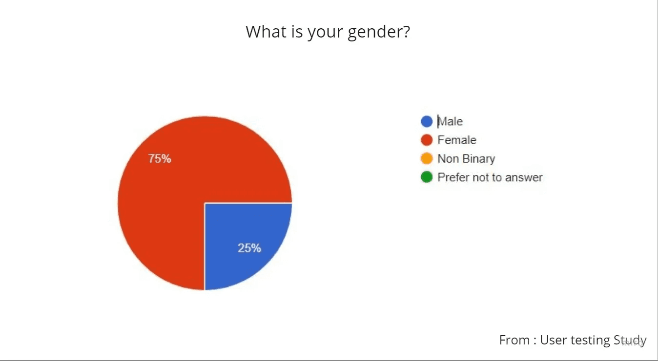
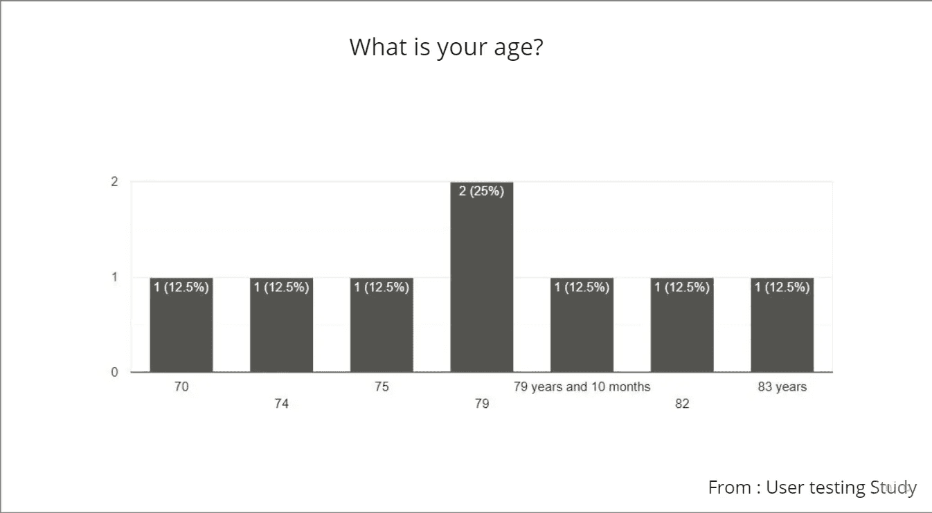
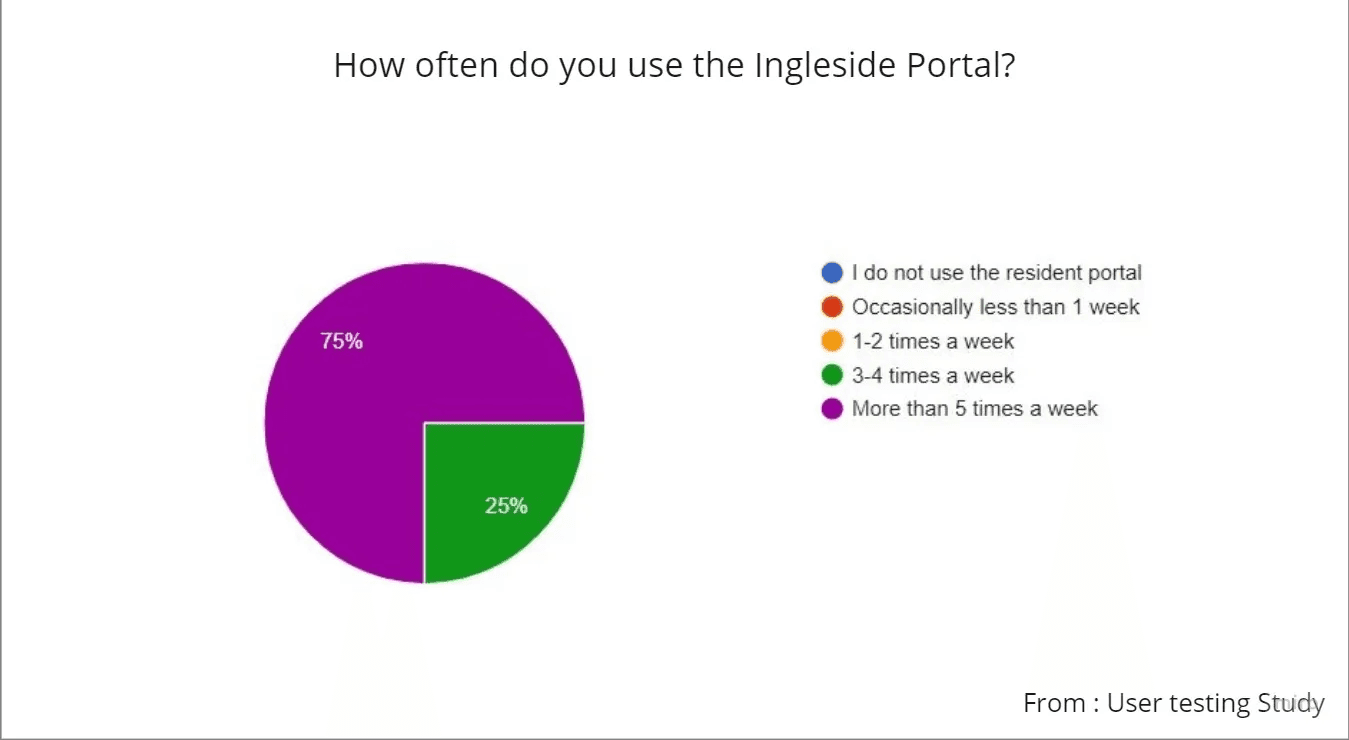
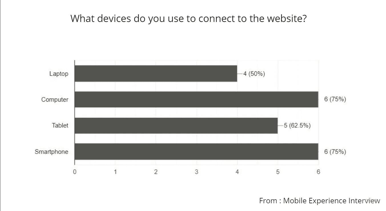
Survey responses confirmed the participant profile: predominantly female, ranging from 70 to 83 years old, using the site multiple times a week. Tablet and smartphone usage was higher than expected — 6 out of 8 mobile interview participants reported accessing the site primarily by smartphone.
This mattered. The redesign had been built desktop-first. The usage patterns said something different. We had to prioritize mobile design for the website in the upcoming release, which was shared with the stakeholders.
05B / qualitative research
Five problems. All pointing to the same gap.
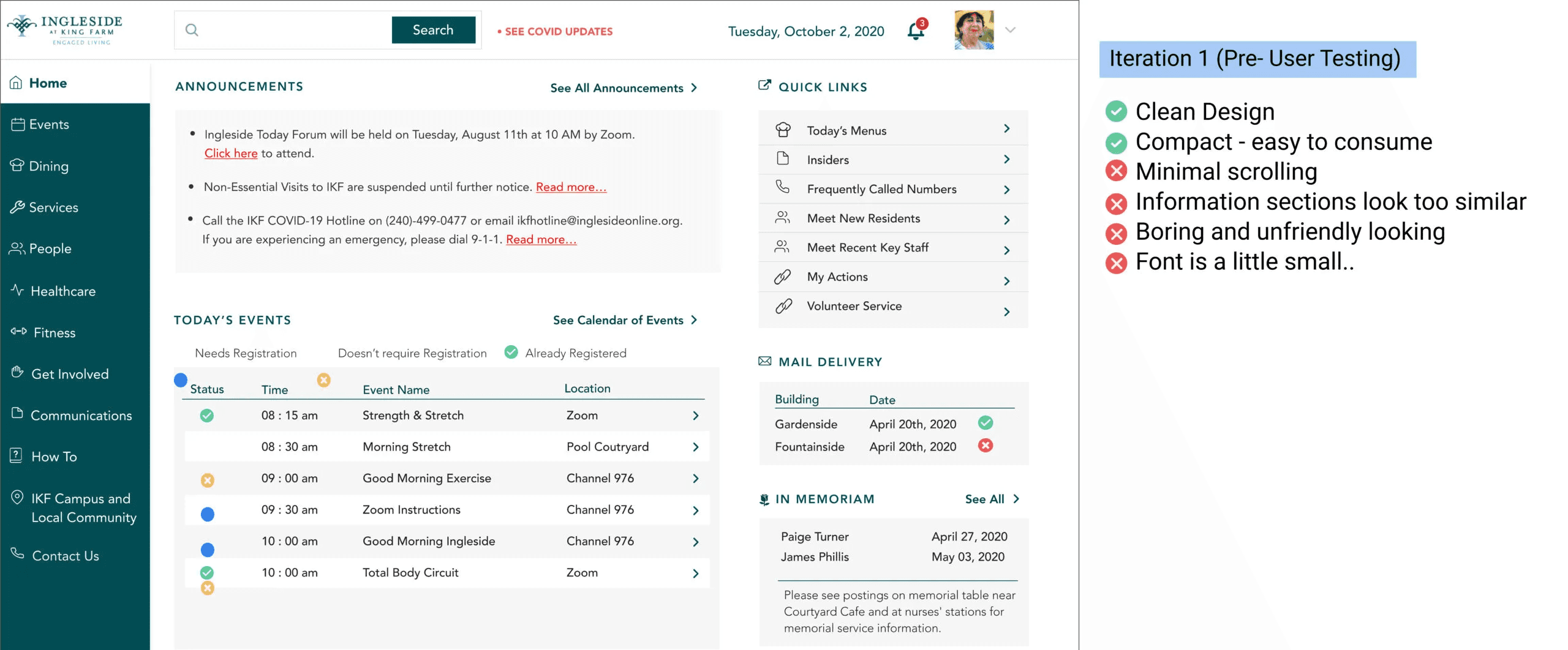
Residents responded warmly to the visual redesign. But usability testing exposed a pattern the aesthetics had obscured: the structure of the site didn't match how residents thought about their own community. Five problems emerged consistently enough to act on.
Visual hierarchy was creating false signals.
Subheadings looked like headings. Underlined text looked like links. For users already uncertain about navigation, unclear structure created errors.
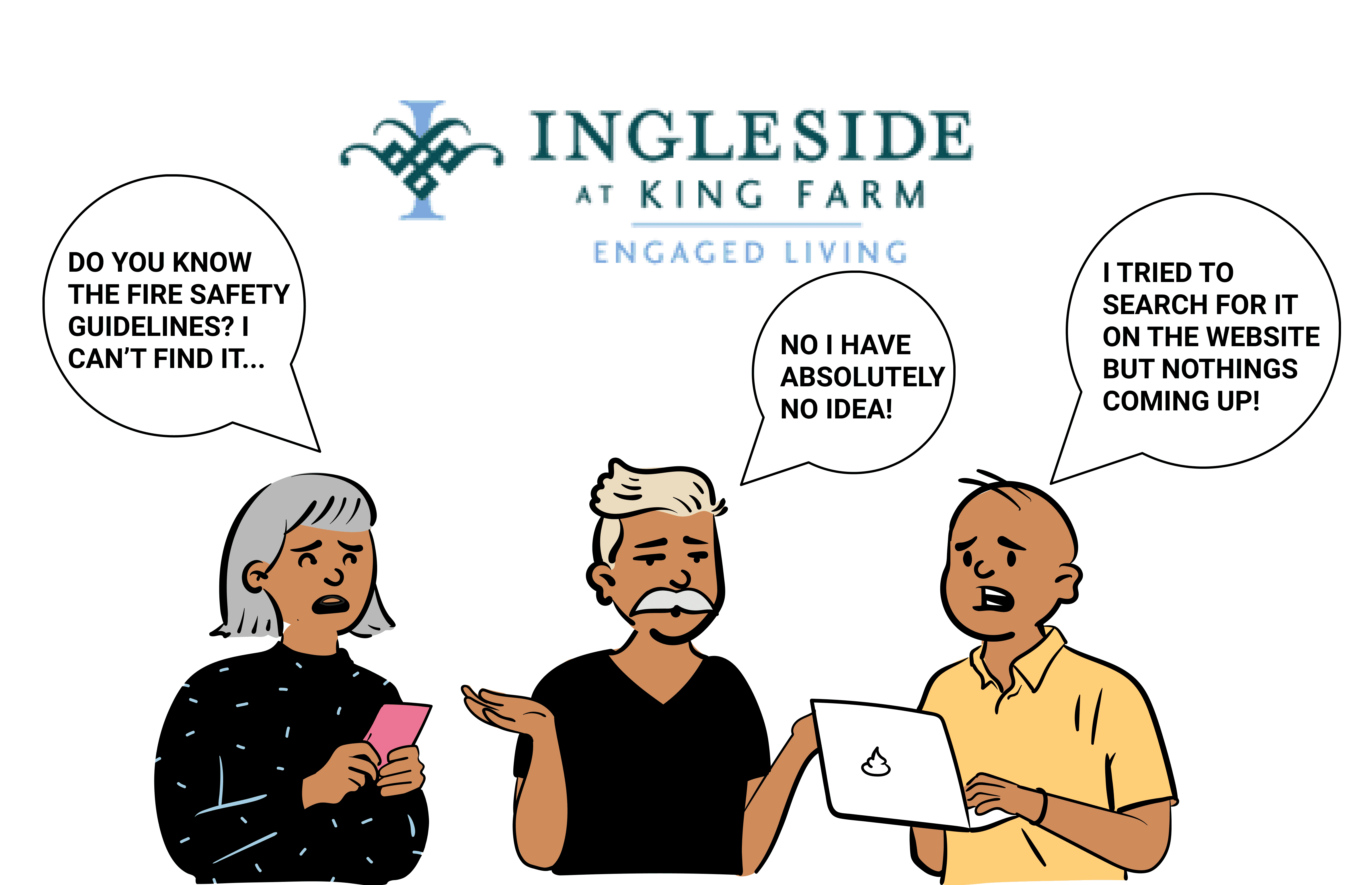
Critical information was buried, and residents knew it.
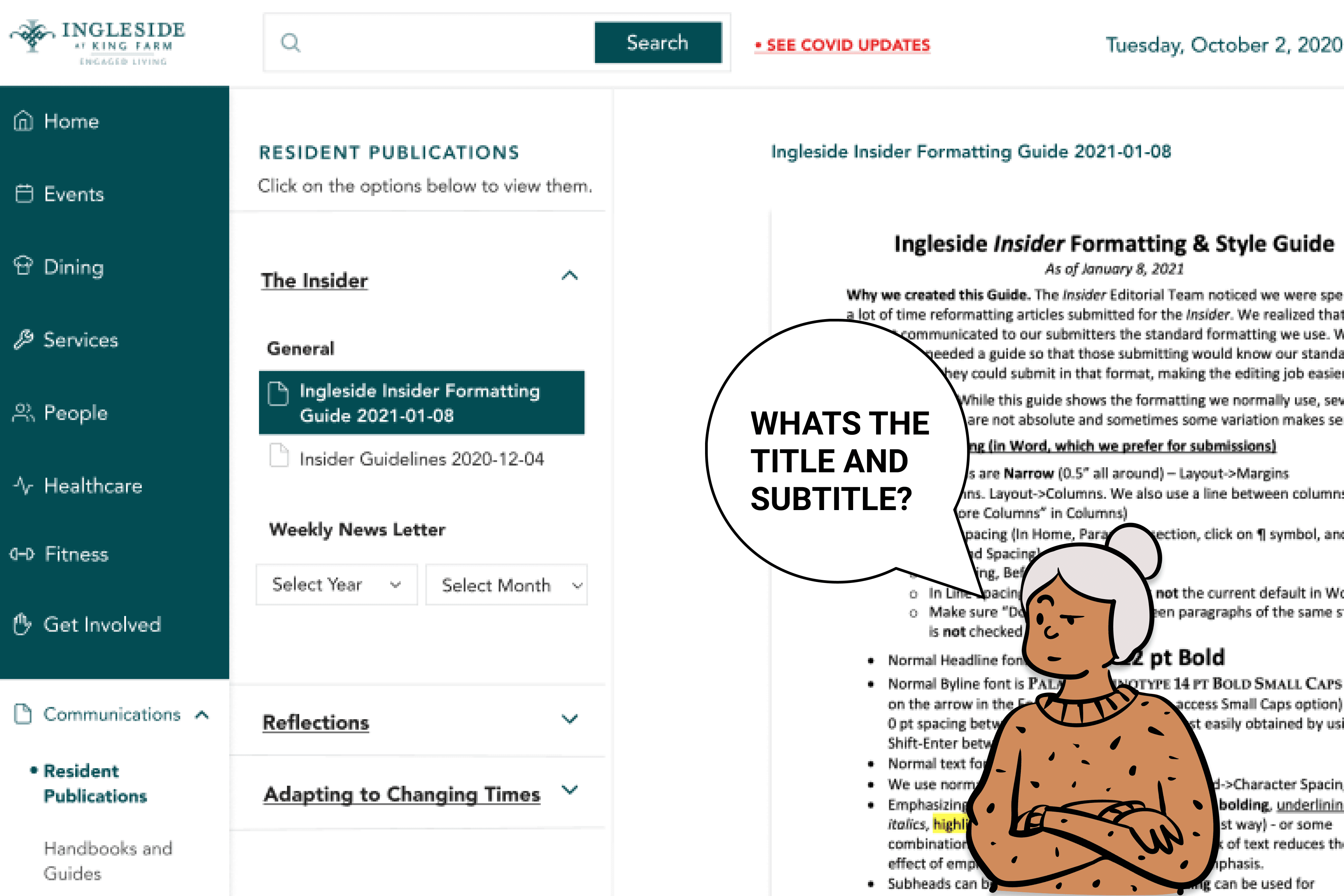
The newsletter ran up to 11 pages. Search couldn't reach inside it. Residents were calling the front desk to find information that should have been one click away.
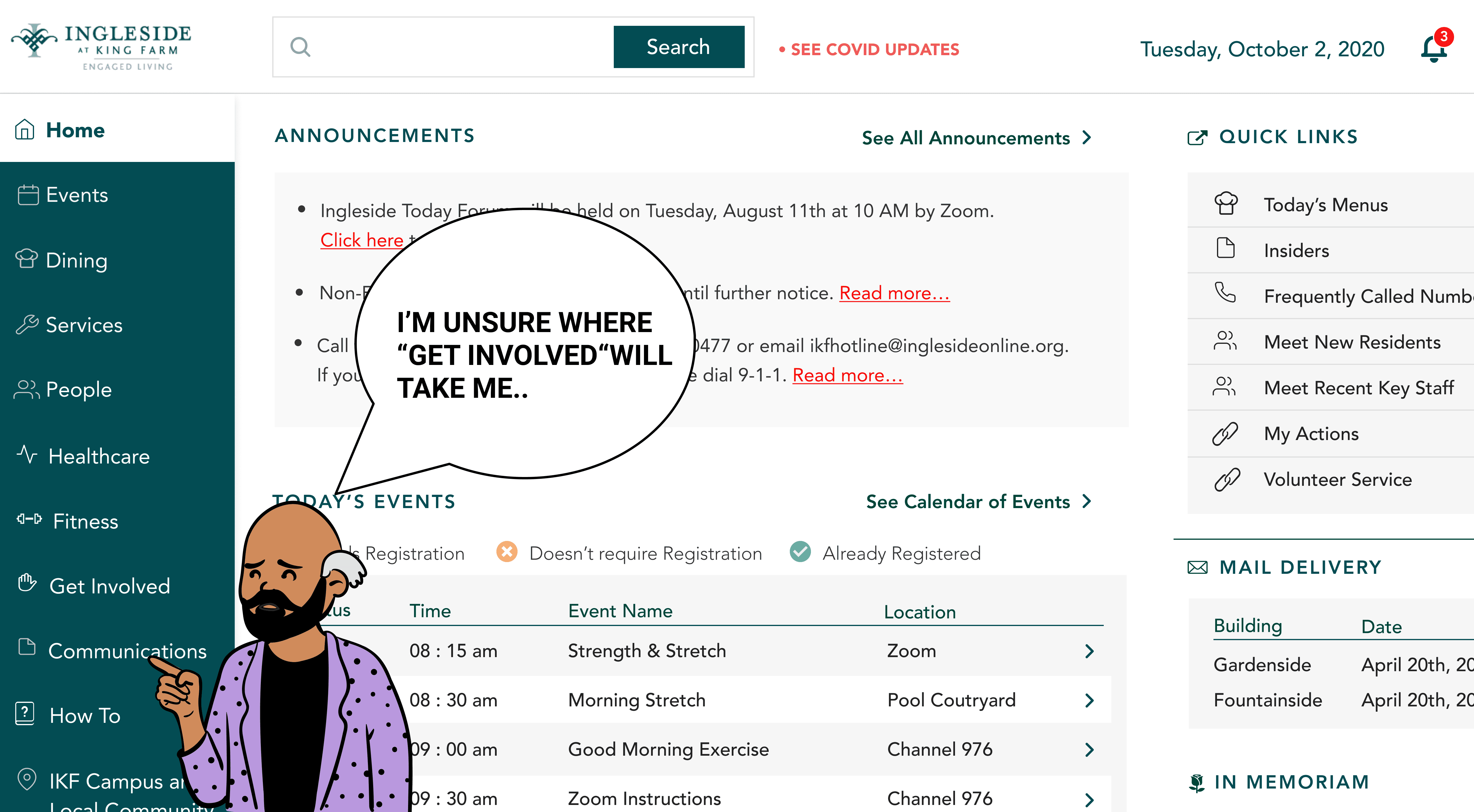
Labels were written for the organization, not the residents.
"Get Involved" led to governance structures. "My Actions" contained submitted forms. Neither label told residents what they'd find before they clicked.
The homepage was functional but not orienting.
Everything read at the same visual weight. For a resident logging in to find what's happening today, that's not a layout — it's noise.
"Get Involved" was overloaded with structure residents couldn't parse.
The section contained advisory groups, interest groups, service groups, support groups, resident council committees — organized in a way that reflected the org's internal taxonomy, not how residents thought about participation. New residents especially had no frame of reference for which type of group was which. The sheer volume of options on one page prompted several participants to close the section entirely.
06 / Prioritization
Prioritizing by failure, not frequency.
I prioritized what to redesign first based on what the research showed about failure modes, not just frequency of complaint, but severity of consequence. If a resident couldn't find emergency contact information or the week's dining menu because search failed them, that was a higher priority than a homepage that felt bland.
I worked in cycles: define the requirement from research, look at how analogous systems handle it, design, get feedback, iterate.
“Sometimes important information is within page 6 of 11 of the insider (newsletter on campus) and then 2 weeks later, I have no idea how to find that. If I try searching for it, it’s as unhelpful as sifting through the documents on my own... ”
- Quote by a resident
06 / Global search
How do high-information systems help people find what they need?
The resident quote about the newsletter made the scope of the problem clear: the search needed to reach inside documents, not just index page titles. That's a federated search problem. I worked with developers to understand what was technically feasible, and designed to that constraint.
A Good Search should be:
Federated - Search through all content through one search query
Faceted - Narrow options and find what they want
Fast - Deliver sub-second response times
Auditing the current search
Before sketching, I looked at two reference points: Google and LinkedIn. Not as benchmarks to copy, but because they both solve the problem of surfacing the right thing from a large, mixed-content system.
Competitive Analysis
From Google, I took:
autosuggest to reduce the recall burden (residents who aren't sure what to search for need prompting, not a blank box)
categorized results to reduce cognitive load
contextual snippets so the result itself tells you whether it's what you need.
From LinkedIn, I took:
result cards that adapt their format to the type of content (a person looks different from an event, which looks different from a document).
This mattered for recognition over recall — if the card looks like what it contains, users don't have to read every word to know whether to click.
The Re-Design : A new global search
The search engine I designed had
Recent searches and auto suggest to help the user
Sections within the results representing categories, as well as easy toggle between the categories.
Context within result cards, whether through text or images.
Search tips for additional help.
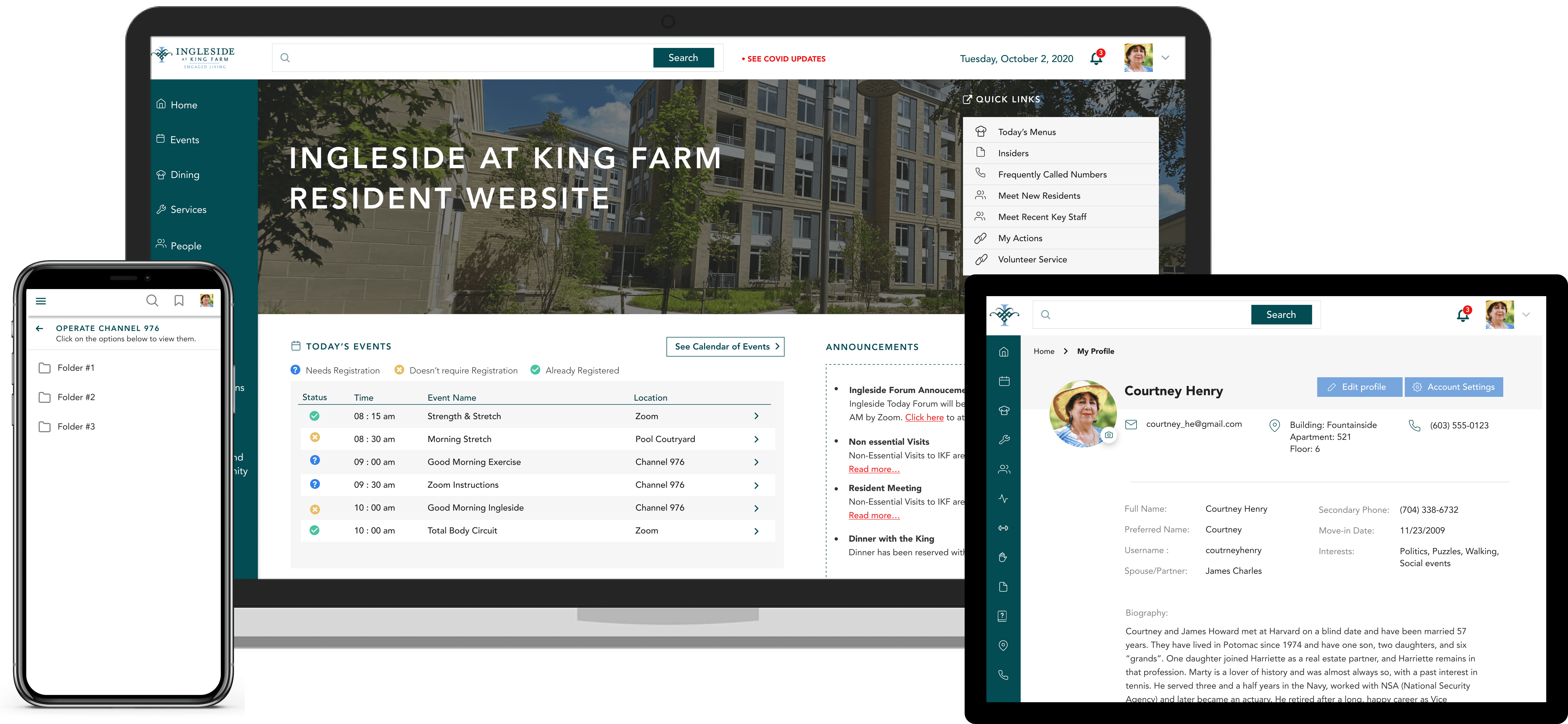
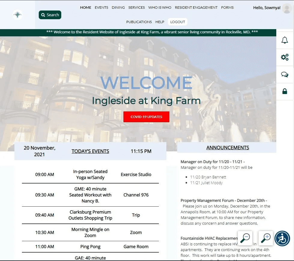
07 / The resident portal
The most-used feature. Built for mobile first.
Google Analytics flagged the directory as the highest-traffic section of the site. Mobile interview participants confirmed it: looking up a neighbor's phone number or email was the primary reason most of them used the portal on their phones.
This told me two things. First, the directory had to work well on mobile — it was the most common use case for the most constrained interface. Second, it was a social infrastructure feature, not an administrative one. Residents weren't filing a form. They were looking for a person.
Auditing the current resident portal
I evaluated the existing design and identified the core tension: the old design gave users too many filters presented simultaneously, which created choice paralysis, while also requiring too many steps to get to an actual result. I designed two layout options — one with all filters visible, one with progressive disclosure — and tested both.
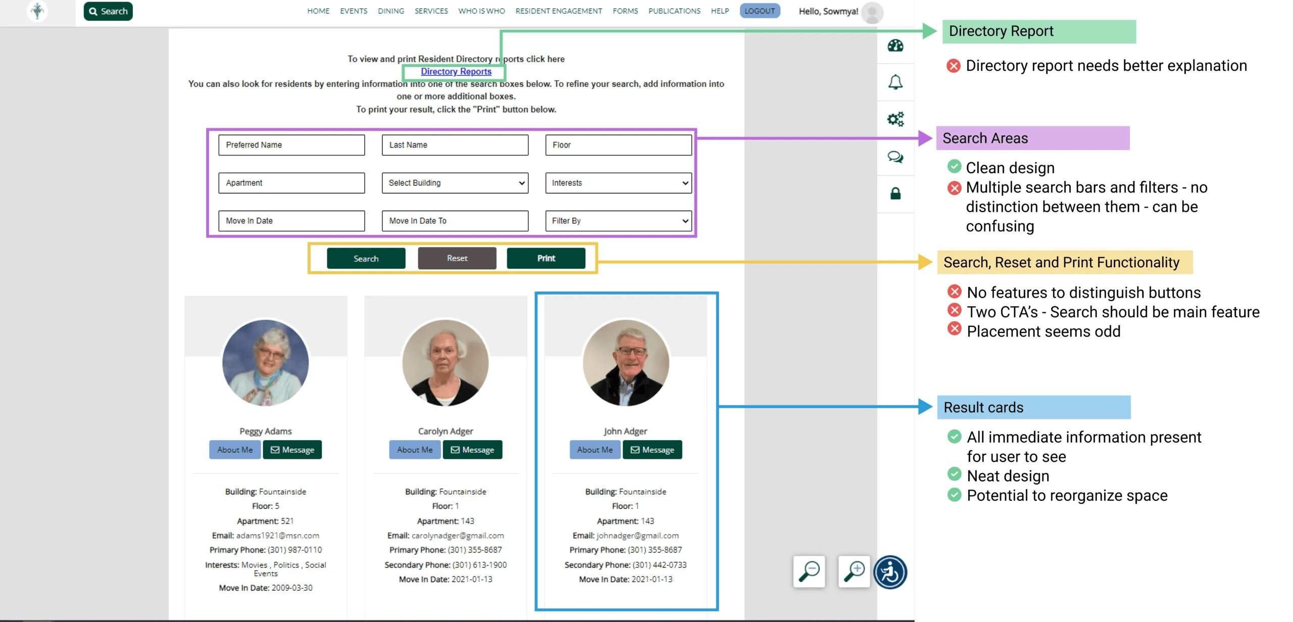
Two Designs, Where one option felt like shopping. The other felt like a search.
Option 1
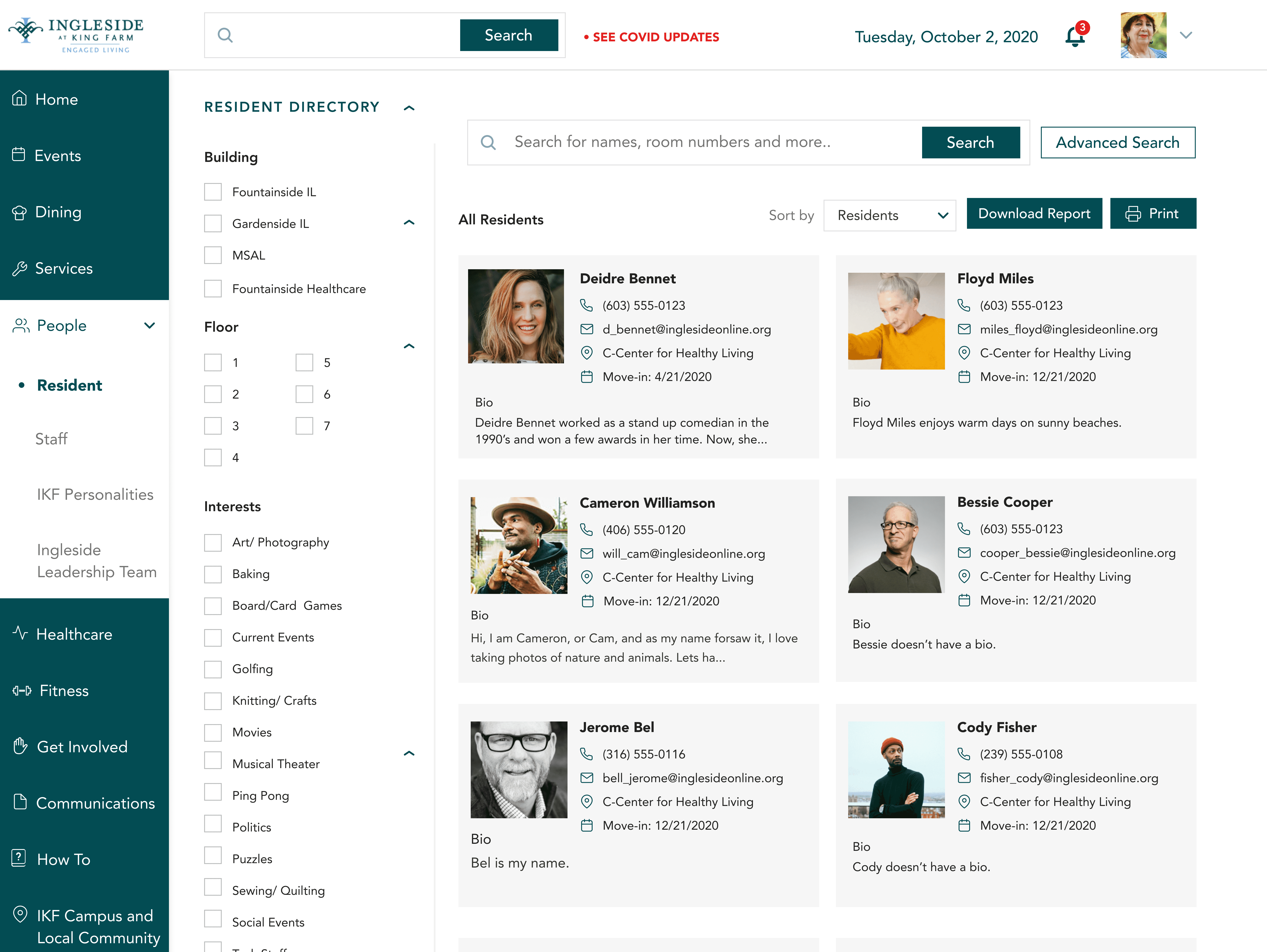
Pros :
All options are available on one page - no clicks required
Follows more one-track mind, easy to comprehend
Good usage of space
Cons :
Must scroll to see all options - cumbersome
Too many CTA's
Option 2
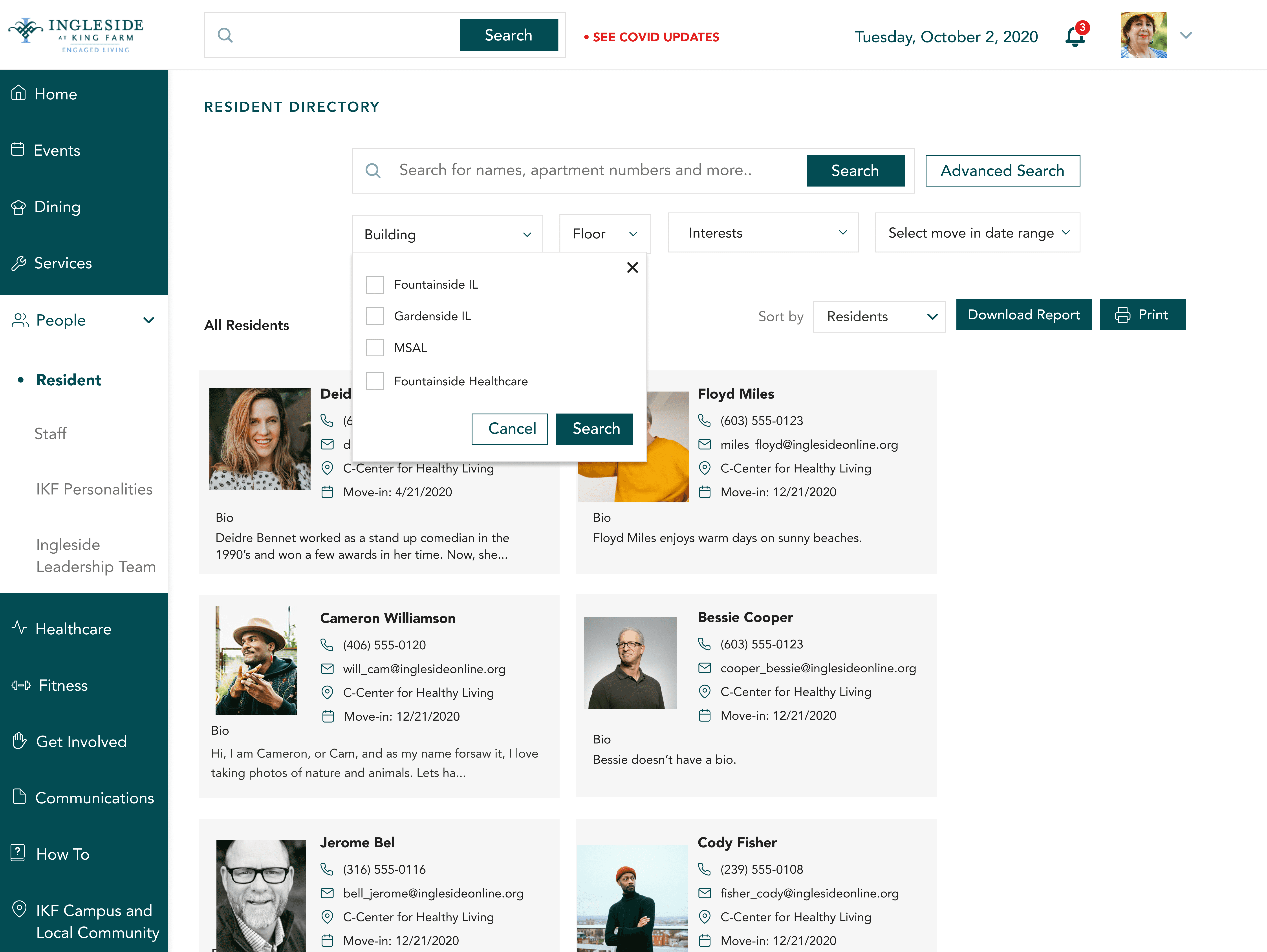
Pros :
Compact design - conserves space
Easy transition for Ingleside users
Individual search possible.
Cons :
Order dependant - confuing
Two search buttons CTA's confusing
The Redesign

Testing resolved the question clearly. The progressive disclosure option (Option 2) won because it looked less like a data form and more like a search. Multiple participants described the first design as feeling like "shopping" — which created the wrong mental model entirely for what they were trying to do. The compact option also reduced the scroll burden, which mattered for tablet users.
08 / Resident Committees and groups
From "Get Involved" to "Resident Committees & Groups"
The naming fix sounds simple. It wasn't. The label "Get Involved" was an aspiration — it communicated organizational culture, not content. Renaming it to "Resident Committees & Groups" made the destination predictable.
Auditing the committees page
But renaming wasn't enough. The page itself was structured around the org's committee taxonomy, which residents didn't share. I worked with the IT committee and CIO to restructure the section around discoverability: a filterable search for committees by keyword, and individual committee pages that surfaced the information residents actually needed — meeting times, members, minutes — in a consistent format regardless of committee type.
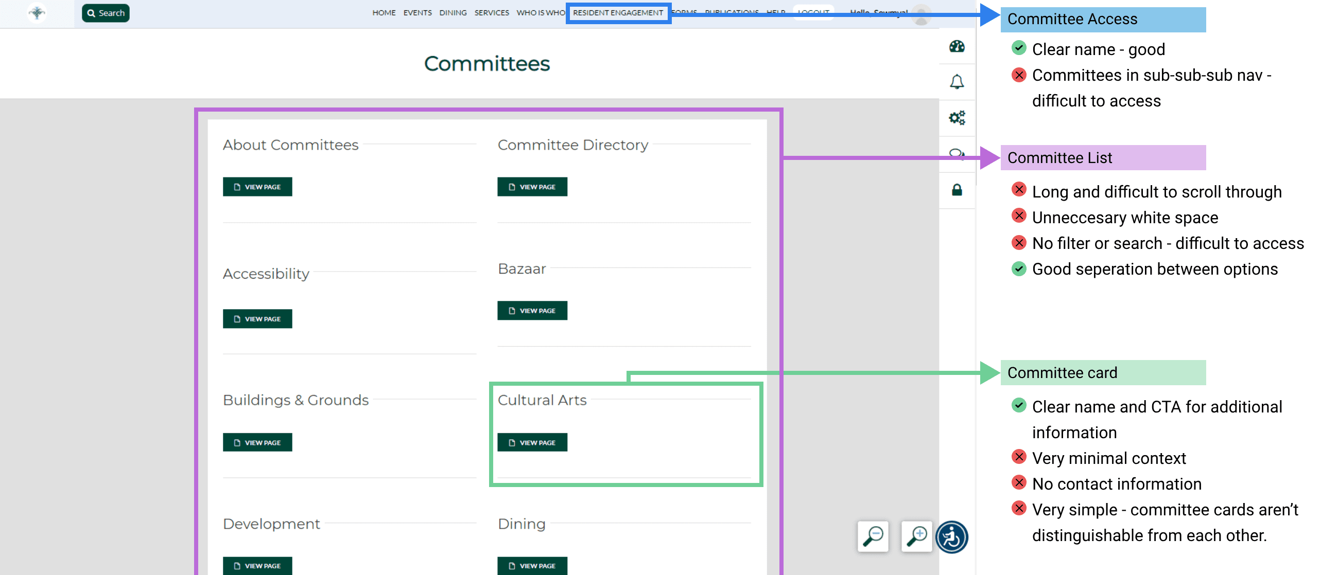
The Re-Design
The redesign focused on increasing visibility on the content each club presented before the user clicked on it, as well as fixing visual hierarchies residents pointed out in usability testing.
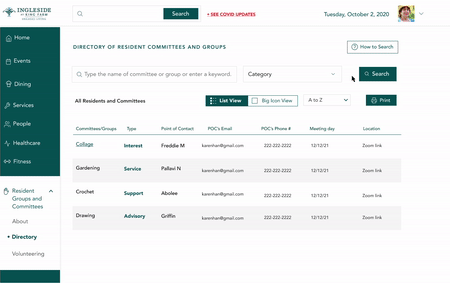
Cards would display information in an organized way, providing context to the user about the club.
Users would have the option of viewing the groups and committees in list or card format.
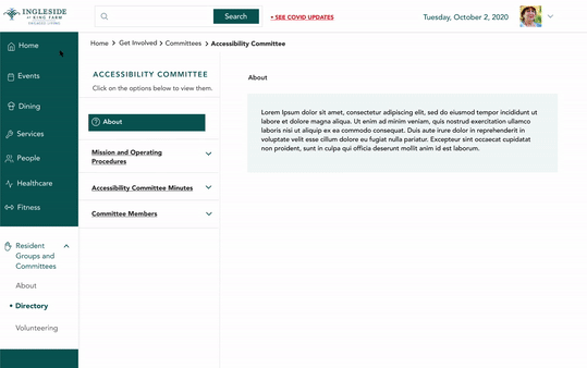
Each committee and Group would have a separate page in the form of a multi PDF Page with:-
About
Information about Committees (By-Laws)
Meeting Minutes (with a filterable option by month and year)
Members of the Committee/Group
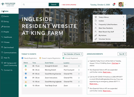
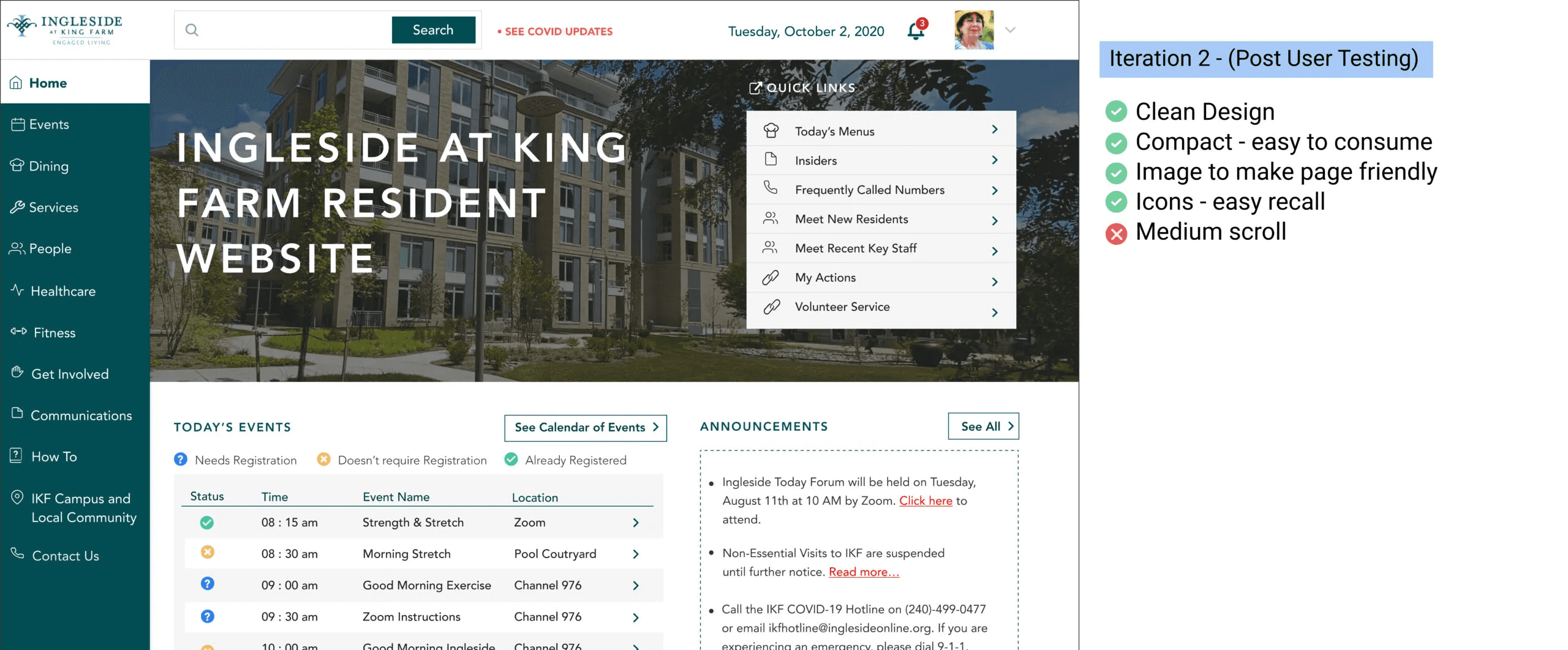
09 / Homepage redesign
Three iterations. One insight about urgency.
The homepage was the hardest problem because it had the most stakeholders and the most opinions. I went through three documented versions.
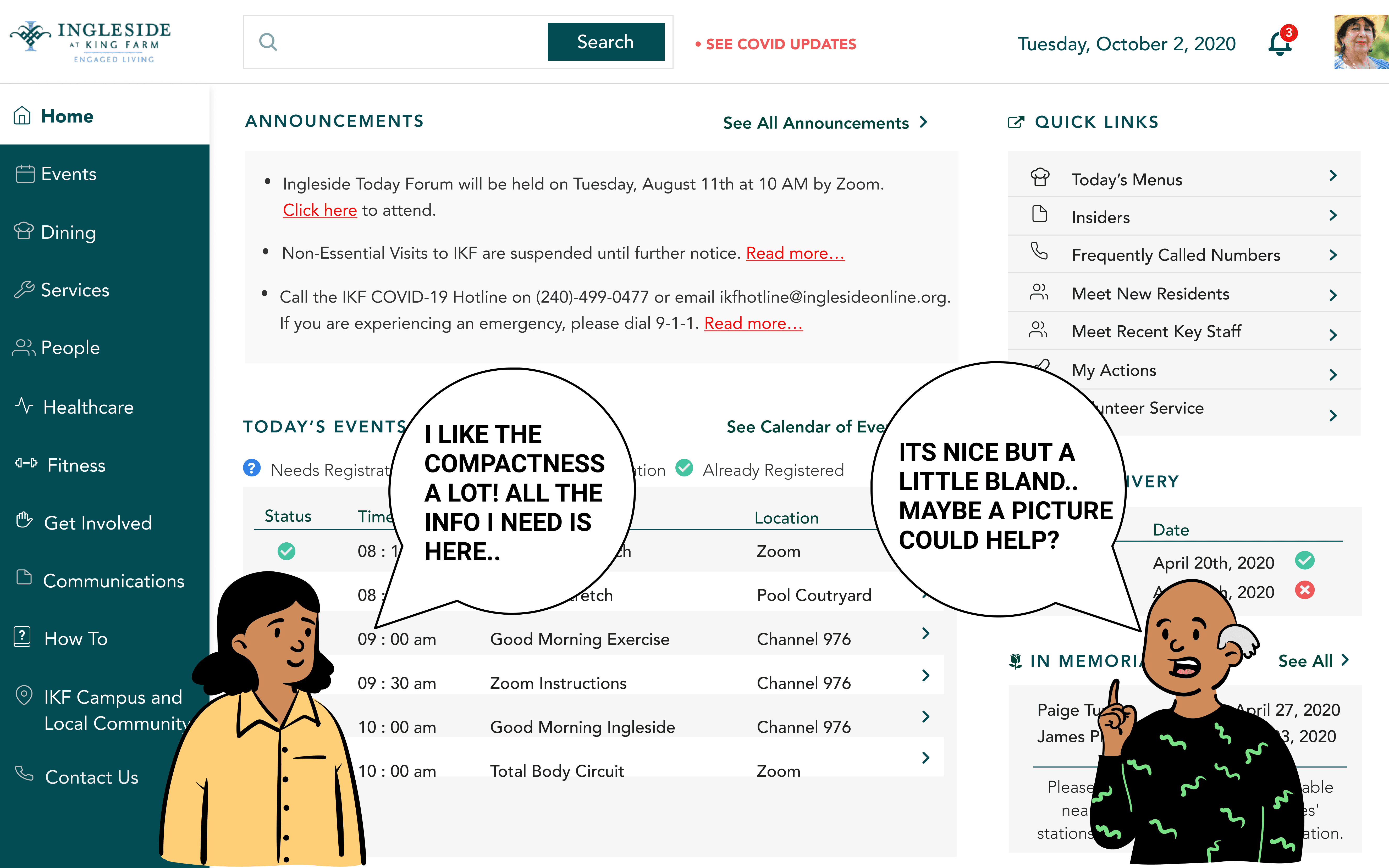
The original site was information-dense but visually flat — everything at the same weight, which made urgency invisible.
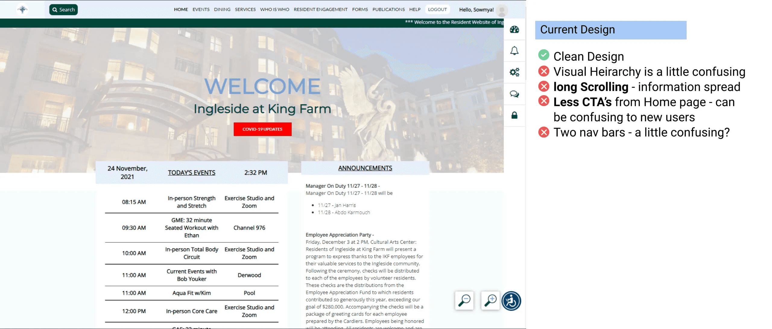
My first iteration reduced the CTA count and tightened the layout, but post-testing feedback was honest: it felt bland and "unfriendly." Residents wanted to feel like they'd arrived somewhere that knew them, not logged into an admin panel.
The second iteration added a hero image from the community itself (sourced from the marketing team), used icons to visually distinguish content blocks, and pulled the most time-sensitive information — today's events, announcements — into a more prominent position. This version tested well. The improvements residents noted: easier to scan, felt warmer, and the colored status indicators on the events list let them know at a glance whether registration was required.
10 / LEARNINGS
What this project taught me about designing for people with the least margin for error.
This project taught me something I've carried since: the gap between "the design looks right" and "the design works for this person" is widest when the user population has the least margin for error.
01
Trust is everything
Designing for seniors isn't primarily about font size and contrast ratios. It's about trust. These residents had to believe the portal would actually take them where they expected to go — every time. One confusing label, one ambiguous button, and they were done. The stakes of being wrong were higher for them than for most users I'll work with.
02
Pushing for research
If I were doing this project again, I'd push for a card sort early in the process, before any redesign work started. The naming and taxonomy problems we uncovered in testing could have been surfaced and fixed at a much lower cost in the information architecture phase. Testing confirmed what a card sort would have predicted.
03
Research Ethics
The IRB process also changed how I think about research ethics. It's not a compliance step. Writing the application forced me to articulate exactly what I was asking participants to do, what risk they were taking, and why the knowledge was worth it. That's a discipline I'd bring to any research project regardless of whether a board requires it.