
01 / ENTERPRISE MOBILE
ExacqVision Mobile
Reframing critical workflows for high-pressure security operations.
Enter password to view case study
"In high-stakes environments, trust isn't a design principle. It's the product."
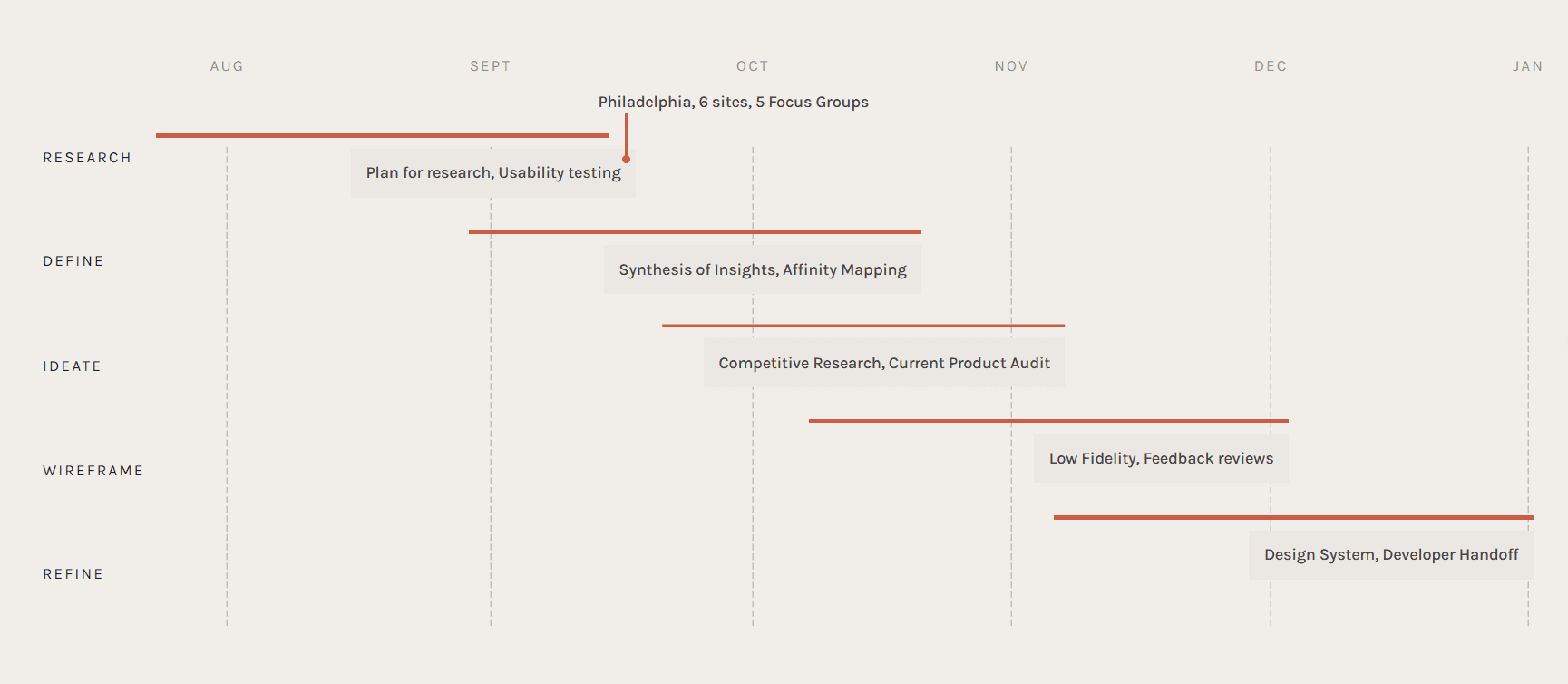
01/Timeline and Tools
My Contribution
Usability Testing
Analysing Insights
Product Audit
Prototyping and Design
Tools
Figma

Miro

Jira

Excel
01 / THE BRIEF
I was asked to modernize the app.
ExacqVision is enterprise security software used by operators who monitor live and recorded video footage across facilities — hospitals, warehouses, campuses. The mobile app was their companion away from the desk. The brief was straightforward: the app felt outdated, redesign it.
We took the brief at face value. Then we went on site.
BEFORE
Developer-driven UI with an outdated design library.
After

Modernized experience built around operator needs.
02 / RESEARCH
Six locations. One pattern we didn't expect.
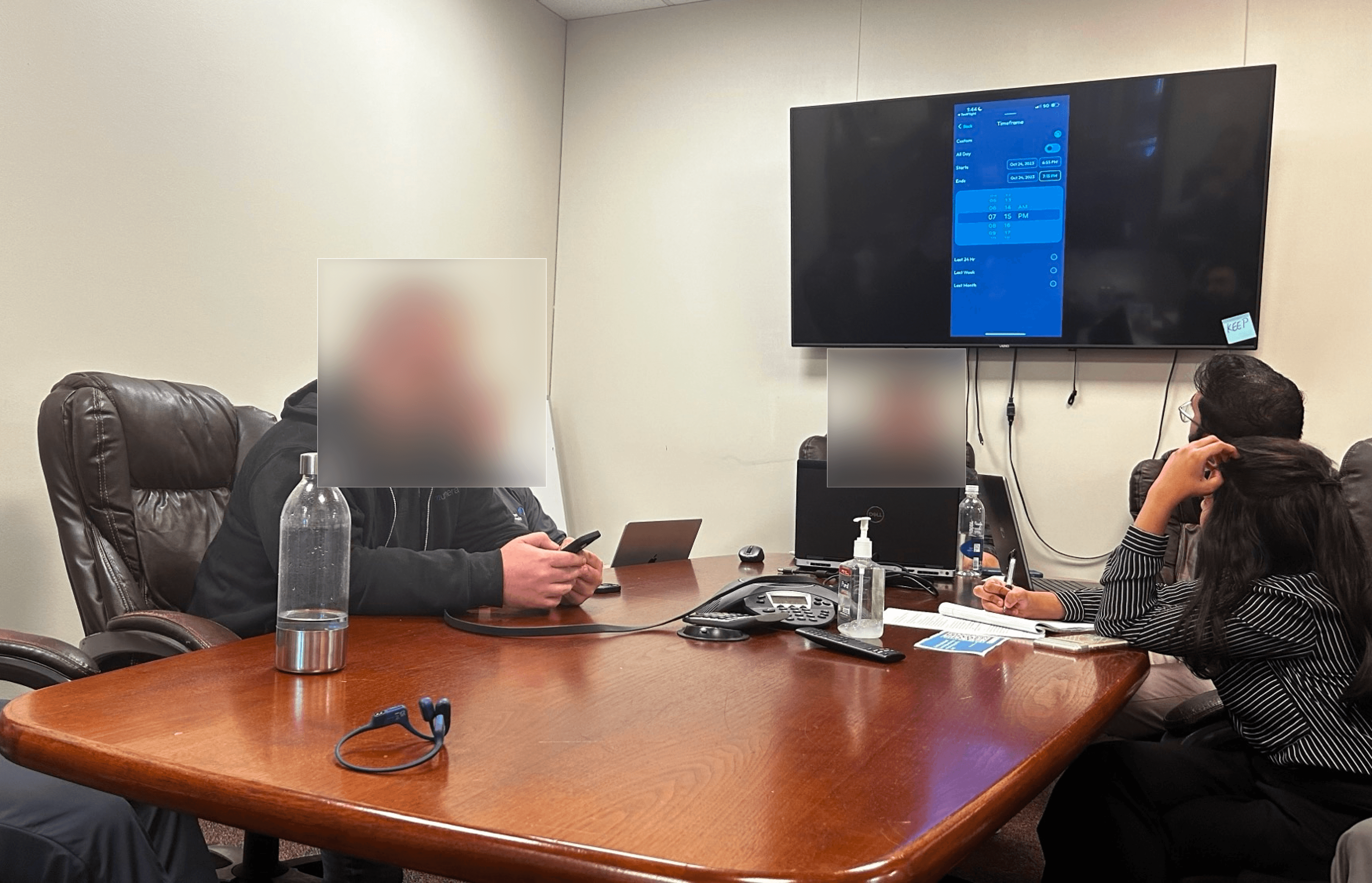
I traveled to Philadelphia with the engineering manager, lead product manager, and another UX designer. The sales team organized focus groups — integrators and clients who used and sold ExacqVision alongside its competitors. We gave participants three tasks on the updated designs and watched what happened.
5
Focus Groups
~40
Customers
Note-taking +
Survey
3
Tasks
Task 1
Find the video of a delivery yesterday at 7 pm.
Task 2
Search for events across 5 different cameras
Task 3
Create a group of cameras for parking lot cameras.
02b / FINDINGS
Our findings
85% failure rate on the timeline task.
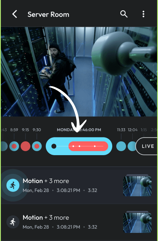
Observed: The task to find footage had 85% percent failure rate. The reason? The timeline scrubber was new and didn't match expectations.
Insight: Designs designed for exploration conflicted with timed-critical needs, where speed and precision outweighed discovery.
Rigid camera groups caused friction.
Observed: When tasked to find live video panels for parking lot cameras, users relayed that in real life, grouping was more ad-hoc.
Insight: Persistent structure became friction when speed mattered most.
Learnability rated a 5.5 out of 10.
Observed: When asked, "How easy do you think it would be for a user to adapt to the new app?" participants rated it 5.5/10. Users cited a learning curve in certain areas.
Insight: Users may struggle initially with the new app due to unfamiliar interactions.
5.50 out of 10
Adaptability Rating per Survey
"If it can't support me during an emergency, I don't want it."
- Quote by Alan, IMI Agency
03 / THE REAL PROBLEM
It wasn't a UI problem. It was a mental model problem.
The original assumption was that the app needed modernization. What we found was something more structural. The system required operators to organize information before they could act — pre-defined camera groups, preset views, fixed layouts. That works in routine conditions. It breaks under pressure.
Security operators don't work in routine conditions. They work in moments where seconds matter and the situation is always changing. We had designed for exploration. They needed a system that adapted to them.
WHAT OPERATORS NEEDED
Respond first, organize later
Ad-hoc camera control
Fast situational scanning
Jump freely in time
Act first, organize later
WHAT THE SYSTEM ASSUMED
Organize first, then respond
Fixed saved groups
Manual group switching
Hidden timeline logic
Structure required upfront
04 / GOING BACK TO LOOK FORWARD
The answer was in the app we were replacing.
Before designing anything new, I went back to the legacy ExacqVision desktop app — the one operators had used for years without complaint. The blank grid stood out immediately. It didn't assume the user knew what they needed. It gave them a space and let them figure it out.
That freedom was the feature. Operators trusted the desktop app because it adapted to them, not the other way around. We had been designing a mobile app that did the opposite.
We brought that principle forward.
Insight
Legacy systems survive for a reason. Before you replace something, understand what it's doing that nobody wrote down.
05 / LOOKING OUTSIDE SECURITY
How do other products handle temporary chaos?
The pattern we were looking for — lightweight, flexible, temporary organization — doesn't exist in security software. So we looked elsewhere.
Figjam
What can I borrow? Lightweight grouping interaction - temporary group creation — users can “select → share → discard.”
Why is it relevant? Aligns with operators wanting to create temporary camera groups.
A Mobile App dashboard.
What can I borrow? Drag and drop objects.
Why is it relevant? Aligns with operators creating temporary camera groups.
Google Photos
What can I borrow? Lightweight grouping interaction - temporary group creation — users can “select → share → discard.”
Why is it relevant? Aligns with operators wanting to create temporary camera groups..
06 / THE SOLUTION
An empty grid. A complete rethink.
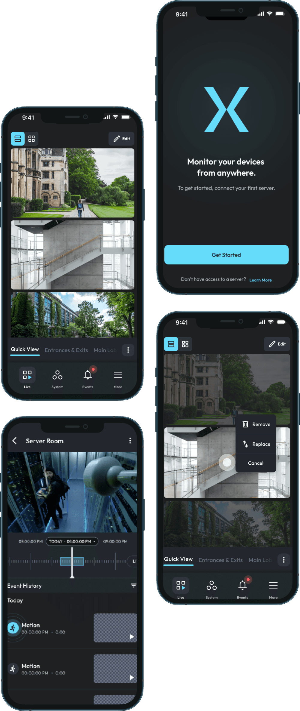
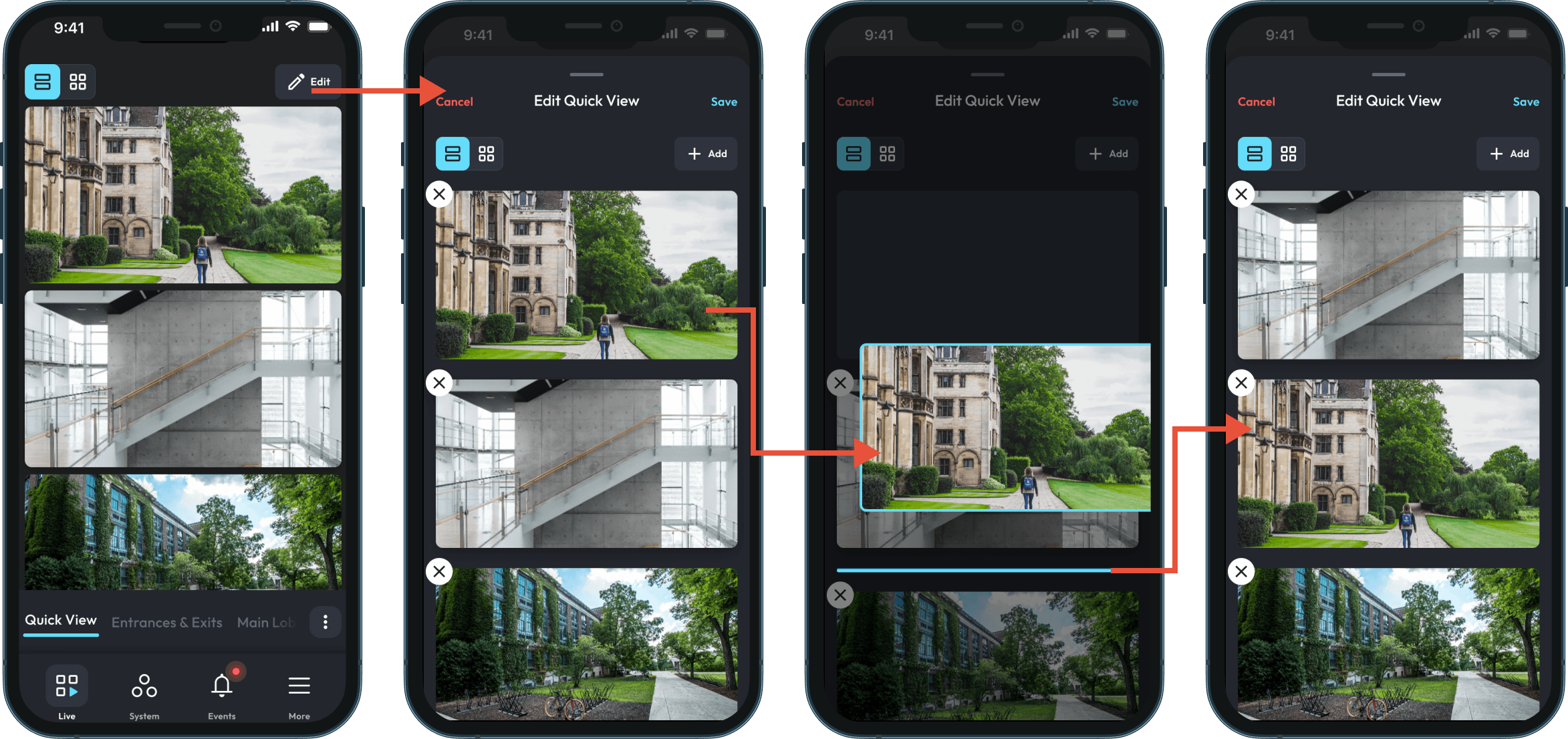
Instead of forcing operators to choose a predefined view, I introduced QuickView — an ad hoc mode that opens with an empty grid and a full list of available cameras. Operators pull in what they need, build a live situational workspace in seconds, and discard it when the moment passes. Nothing is saved unless they choose to save it.
Low fidelity Mockups
I designed with a whiteboard in mind, with drag and drop capabilities. (Refine.)
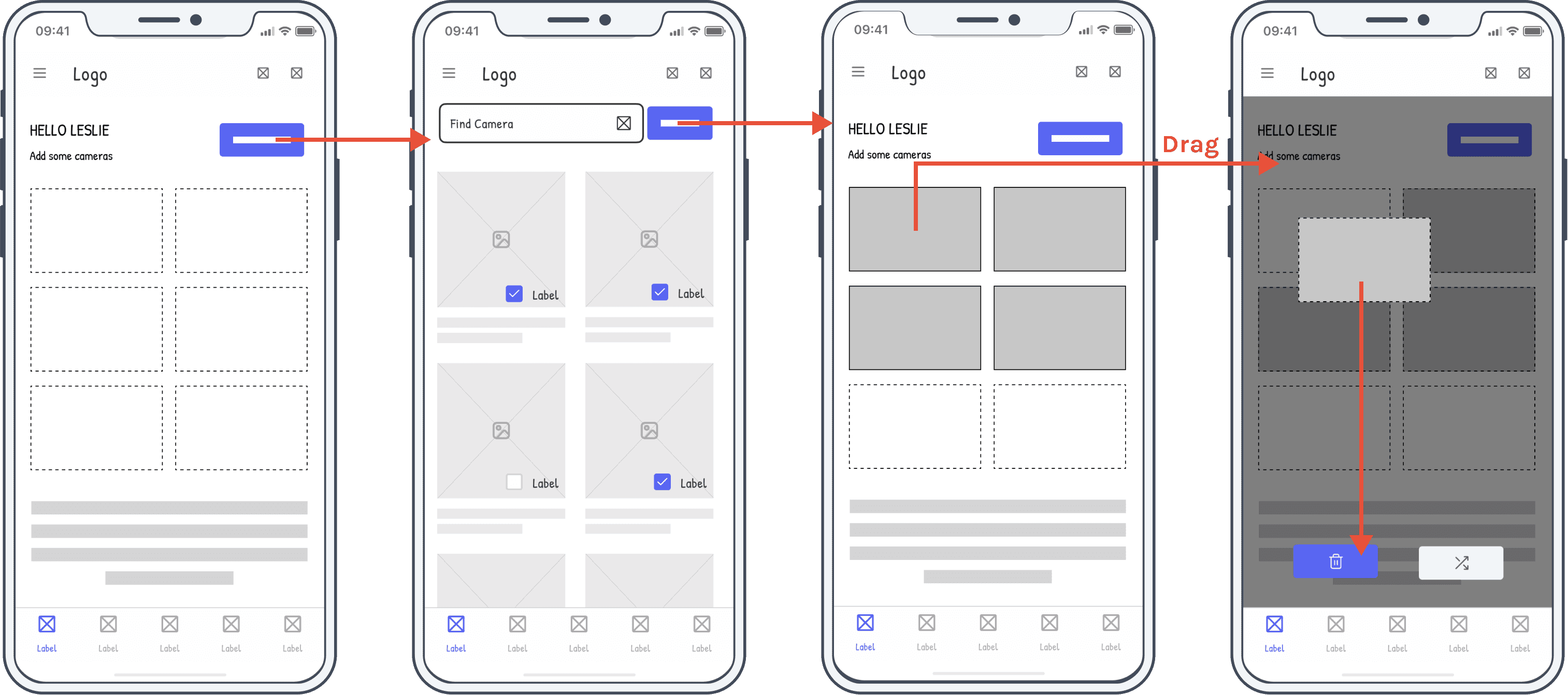
High fidelity Mockups
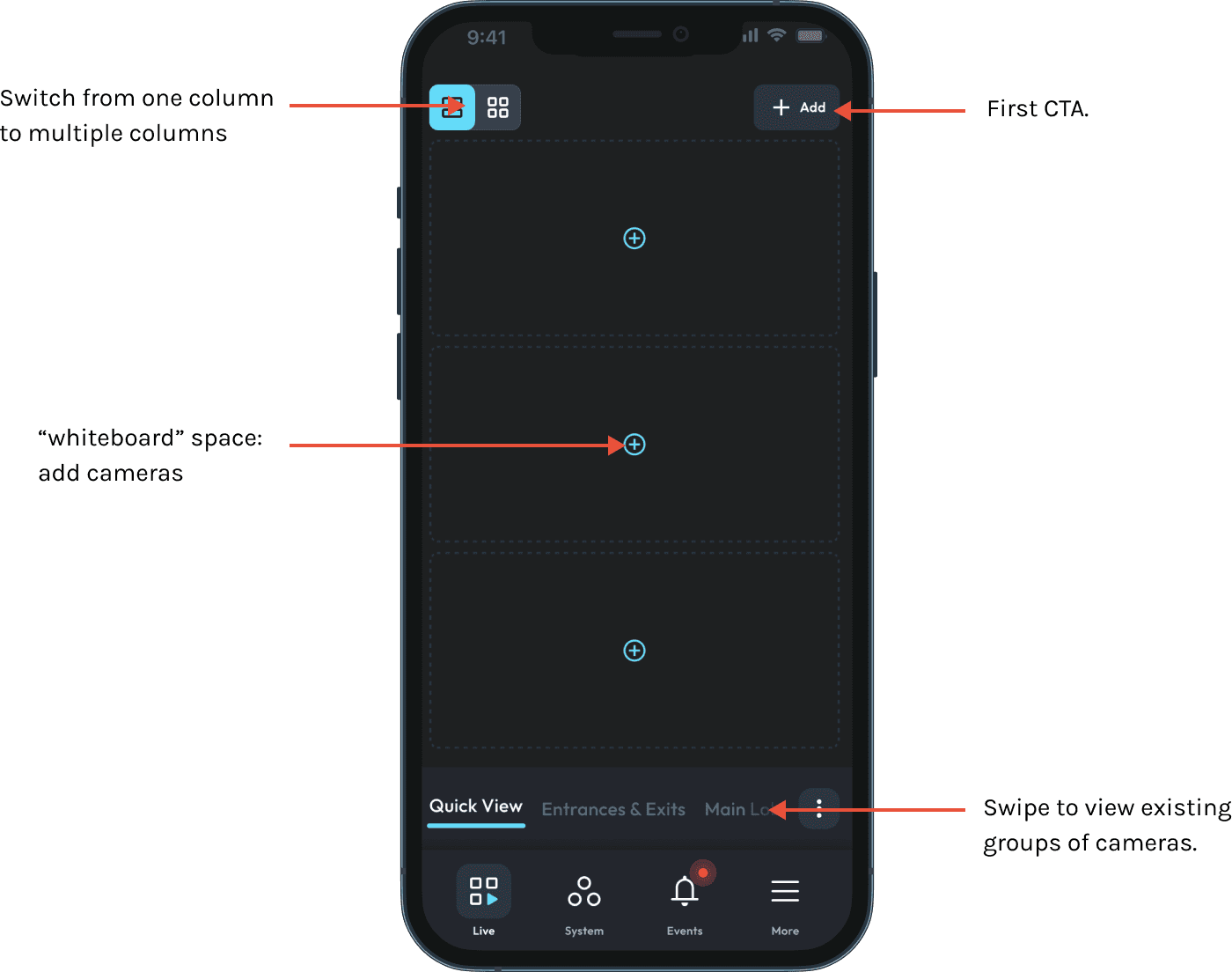
Flow #1 : Create a Quick View
When a customer downloads the mobile app, the screen opens up with the Quick view. Here, the user can add, delete and customize the view as per their needs.
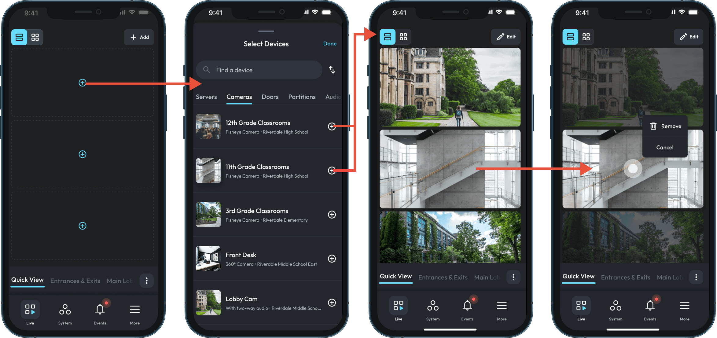
Flow #2: Edit a Quick View
When within a Quickview, the user could edit the view freely, adding and removing cameras, as well as reordering them.
Impact Stat
The new flow gave operators creative control and confidence.
57%
of all operator time in the app was spent inside QuickView. — Glassbox session data
"This feature was a must for the mobile app."
- Customer from Genesis
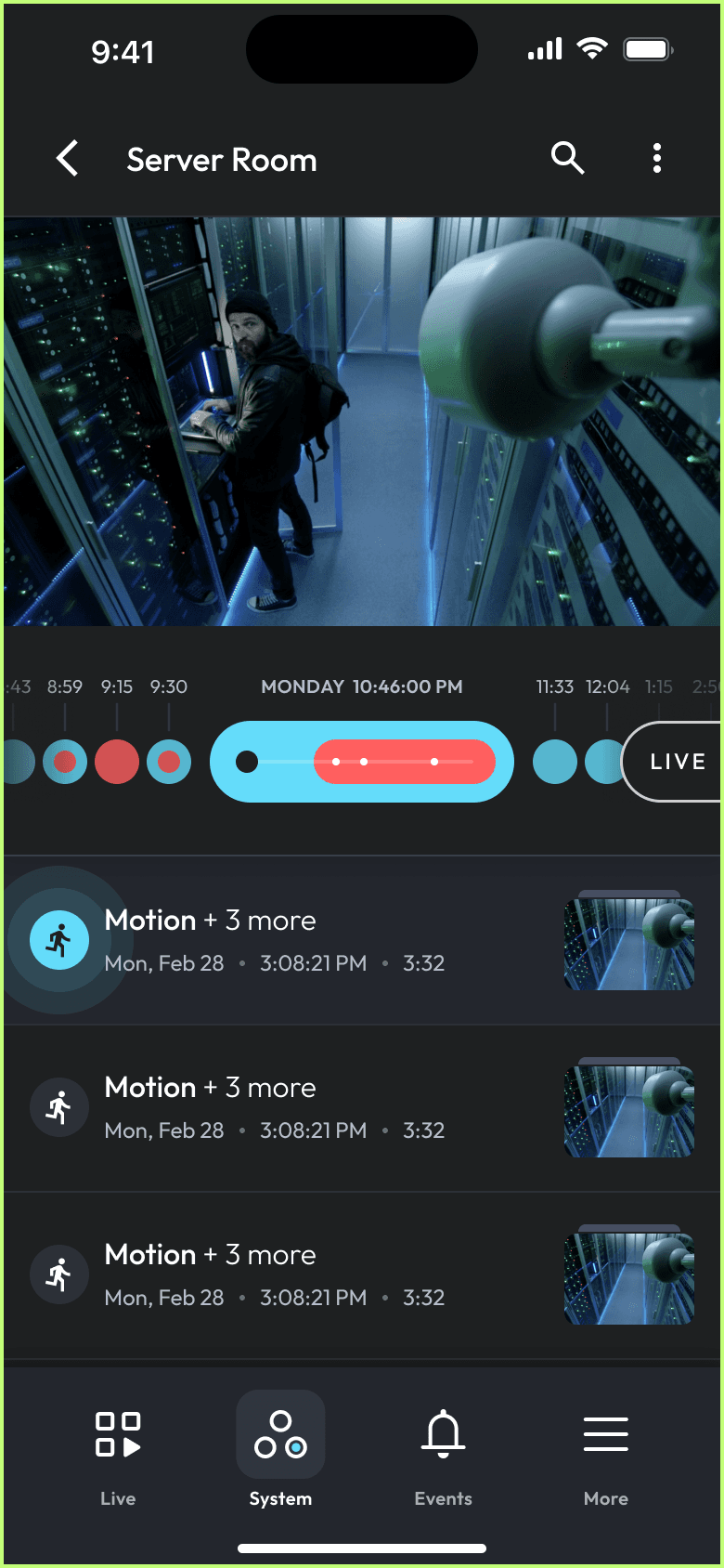
06b / TIMELINE
The same lesson, applied twice.
The same insight extended to the timeline scrubber. Our first redesign used a bubble-based approach — visual, modular, meant to feel fresh. It failed testing immediately. Operators couldn't parse the bubbles under pressure and their scanning rhythm broke. We scrapped it, looked at how Ring handles event-based timelines, and rebuilt around a linear scrubber with color-coded events and a "Jump to" feature for direct timestamp navigation. No learning curve. Operators adopted it immediately.
New Design - Bubble Timeline
"Bubble-based." Operators couldn't parse it under pressure.
What users Were Used to - Linear timeline
Timeline with events presented in a single line format, quick for users to adapt to.
Solution - Linear timeline with "jump to"
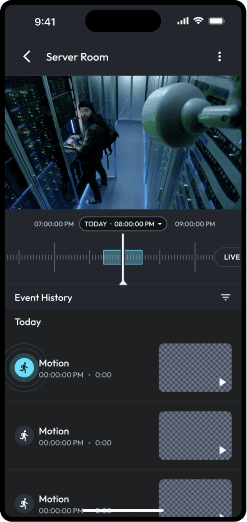
Linear scrubber. Color-coded events. Jump to timestamp.
"We need the UI to be stupid simple. User confusion can lead to major repercussions."
- Todd, Genesis
07 / OUTCOME
From 1.6 to 4.1. And what it took to get there.
The app launched on iOS and Android in May 2024. The previous ExacqVision mobile app had a 1.6 rating. The new one launched at 4.1. But the number that meant more to me was 57% — operators choosing QuickView over every other feature in the app, in the moments that mattered most.
08 / BEYOND THE APP
The project changed more than the product.
Two things shifted inside Johnson Controls as a direct result of this project.
SALES AS A RESEARCH PARTNER
The on-site testing process built a direct relationship with the sales team. Usability testing became a regular part of the product cycle — something that hadn't existed before.
UX VISIBILITY AT JCI
Before this project, UX at JCI meant UI. Designers were executing visual decisions, not shaping product ones. This project changed the internal conversation about what UX is for.
09 / LEARNINGS
What this project taught me about systems.
This project taught me a lot about security systems.
01
Question the brief before you answer it.
The problem was never modernization. It was a mismatch between how the system organized information and how operators needed to access it. That distinction only becomes visible if you go and look.
02
Legacy systems carry institutional memory that documentation doesn't.
The desktop blank grid wasn't a design accident. It was a decade of operators telling the system what they needed. The answer was already there. We just had to read it.
03
In high-stakes environments, control is the feature.
Users in pressure situations don't want guidance. They want a system that trusts them to know what they need. Design for capability, not correction.